 |
| Drawing done in Procreate |
When it comes to drawing I've always been a little intimidated by colour. Okay maybe a lot intimidated. There's plenty going on in a colour image and many things to consider. I'd only read enough colour theory to get that it's pretty complicated stuff and I best avoid messing around with it.
This drawing of a cello head was one of the first finished ones that I did in Procreate on the iPad Air. The cello sits in my living room and is lit by sunlight coming from the living room windows and back lit slightly by an incandescent lamp from the kitchen giving it both the bluish and yellow highlights. I decided to work on a neutral brown background because I thought it would be easier allowing me to focus on the highlights and shadows. Like a lot of stuff that I do this was primarily done as an experiment to learn how to deal with light on these surfaces.
I am reluctant to call these "digital paintings" because the technique that I use doesn't feel like painting at all. I set my stylus point size to 7.0% (I'm not really sure what Procreate means by these percentages but that's what it is) which, with a canvas size of 3000x4096 pixels, as in this drawing, it's a very fine line. I work in a cross-hatch scribbling motion that is more like the way you would draw with pencil crayons or pastels.
 |
| A detail of the cello head. |
I set the pressure sensitive opacity to about 60% so the harder I press the more opaque the stroke. If I understand this correctly I think that means at the lightest pressure that will register I get about a 60% opacity stroke. This makes blending a joy and feels very natural, like the light touch of a pastel. I don't use any specific blending tools. I really dislike the smeary look that creates. The only other tool I use is the eraser which I will set to various sizes and almost always at least 50% opacity or less. I work zoomed in. Quite often very zoomed in. It is one of the greatest advantages of drawing on an iPad or computer. Well, that and "undo!"
 |
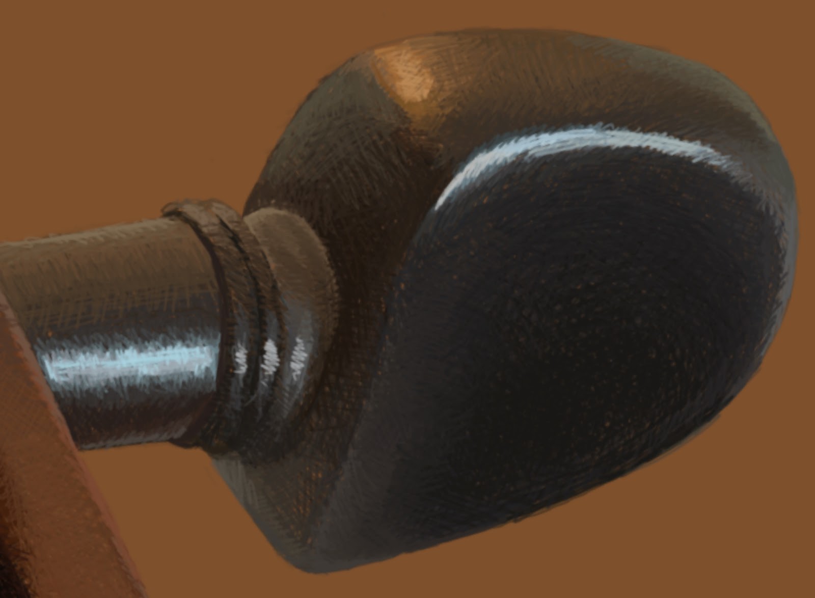
| Detail of a peg. |
Another obvious advantage is the ability to work in layers. I mostly stick to just a base layer, in this case the brown background, and a single layer that I draw on. I will occasionally add a layer so I can experiment with an idea that I will either merge with the drawing layer or discard when I realize what a bad idea it was. When working from a photo reference I like to place the photo on the topmost layer allowing me to quickly flip to see how I'm getting on. The iPad Pro can also do split screen view so I can view the image to the side which can be very helpful if you want to see the whole image while working zoomed in on a detail. Admittedly the pallet of this drawing is not the widest range but I learned a lot from the process—I learn something new with almost every drawing—and it did go on for 20 hours or so.
 |
| A portrait done in Procreate |
Of course there are draw backs to digital art. No physical thing to hold in your hand for one; unless you pay an arm and a leg to get a high end giclee print. The technology is not cheap either but in the long run it may actually be comparable to traditional media. Obviously that's just a very short list but the biggest drawback to my mind is the resistance you face when those who have no idea what goes into a digital drawing or painting (often any drawing or painting) seem to think you have somehow gotten away with something. The truth is that in a way you may have. Digital drawing for many reasons is faster and cleaner and by it's very nature much more forgiving. Being able to take back a stroke or two or three, save multiple versions of the file you're working on for later experimentation, working in layers you can turn off and on or merge or shuffle about, and carry your entire studio around in a shoulder bag that you can pull out and play with at almost any moment.
For me it completely removed the "fear of the blank page" I know held me back so often. I still love the feel, smell, look and sundry trappings of real physical drawing on paper. But I like this tool and will continue to try to get as much out of it as I can. As far as colour goes, even if you poo poo the world of digital art you would be remiss to ignore it as a valuable learning tool. The RGB gamut is massive and you're painting with light, you know, just like the real world does right before your eyes. More so than paint on a canvas.
No comments:
Post a Comment